Selected design systems,
curated — not collected.
Identity systems, brand exploration, presentation architecture, marketing walls, and social grids. Every spread shows the system and the thinking — never an isolated screen.
Identity Systems
Concepts argued, systems documented, marks tested in application — identity as infrastructure, not decoration.
Villa Angelina
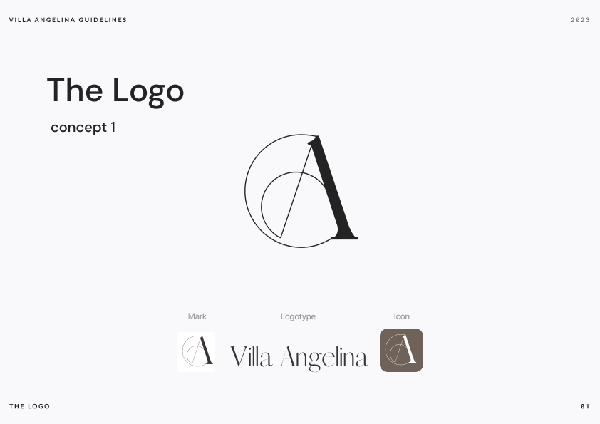
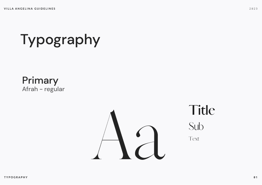
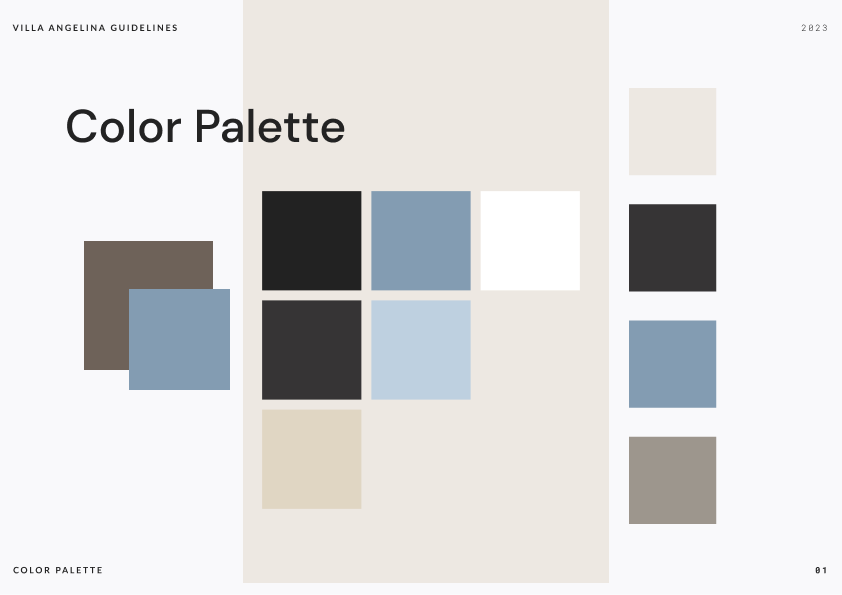
The full discipline at boutique scale: a script monogram supported by a documented type system and palette — the guide, not just the mark, so the brand survives every future hire.
Cloud Bear
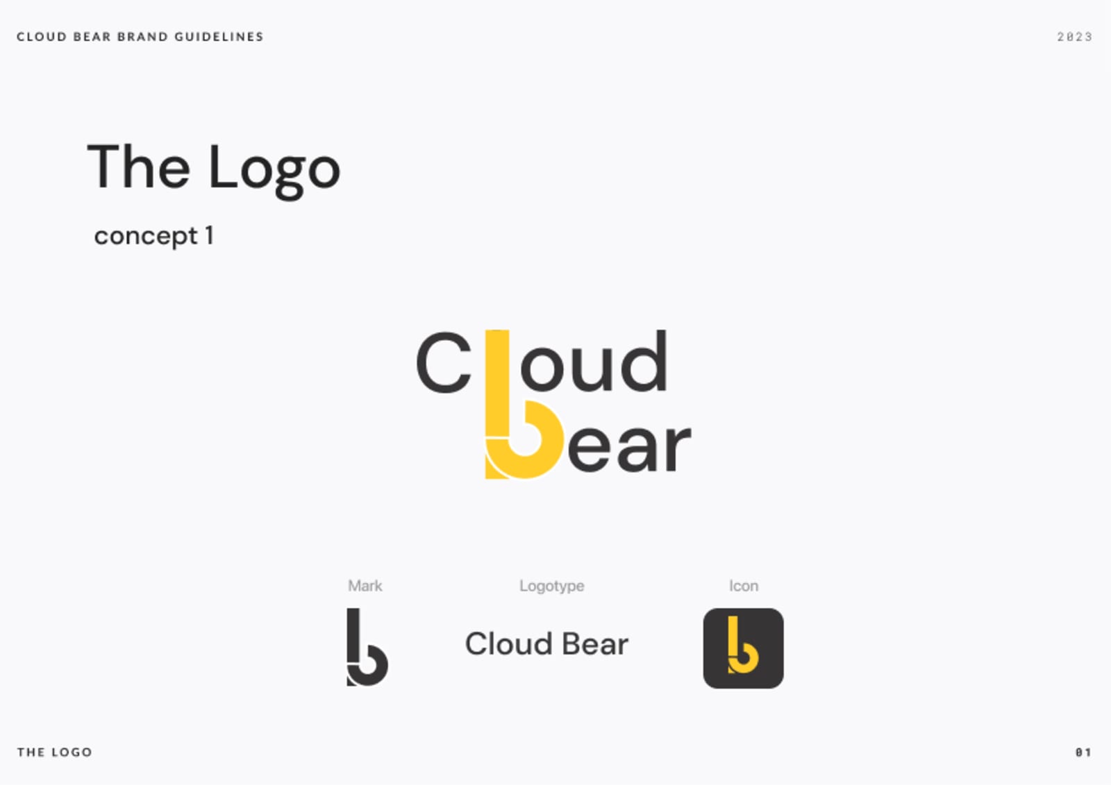
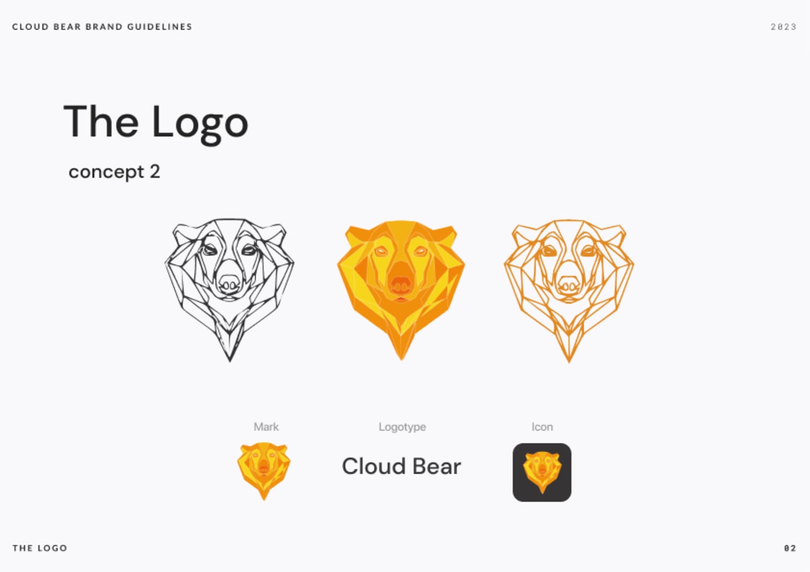
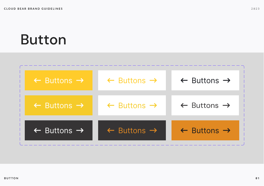
Evolution shown, not skipped: a quiet typographic direction against a graphic bear — each carried through mark, logotype, icon, and UI elements before the client chose.
Clean Designs Guru
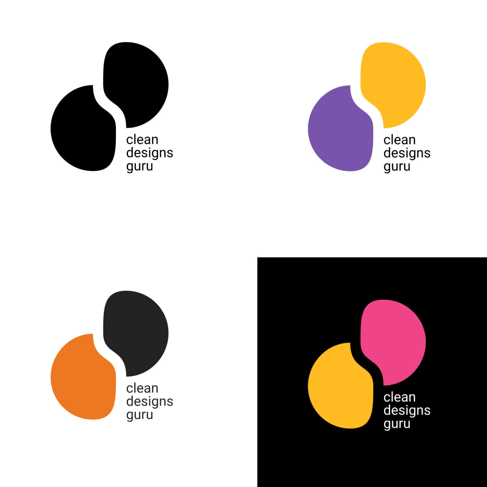
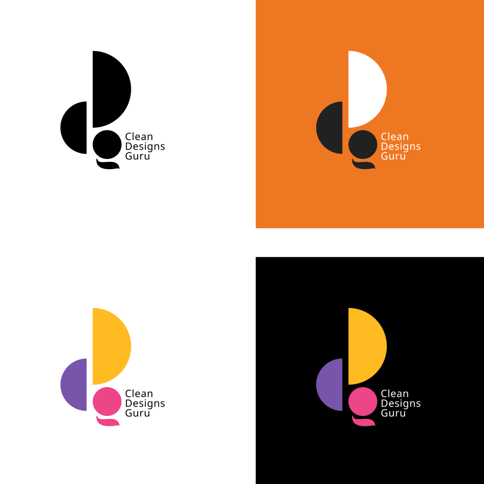
Process on the page: two letterform logics, each stress-tested across black, single-accent, and multicolor versions on light and dark grounds — the system proven before the style is enjoyed.
Brand Exploration — New Level
Strategy before style: how a premium property brand was reasoned into existence, in two complete concepts.
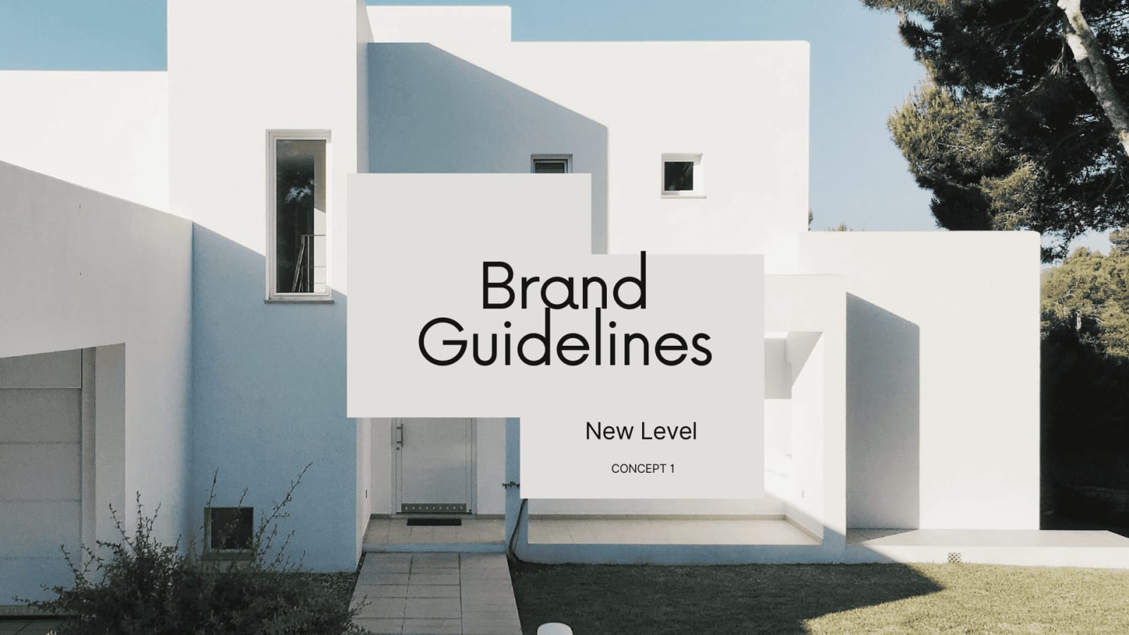
01 · The premise. Concept 1 opens on architecture, not decoration — the brand promise stated by the cover itself.
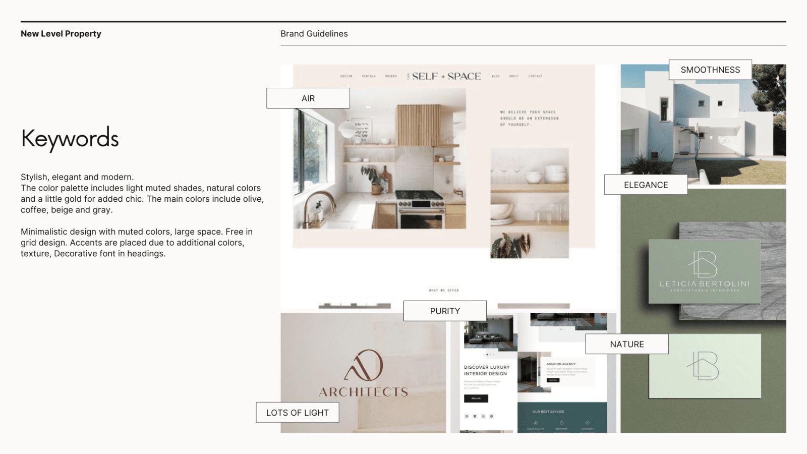
02 · Keywords. Air, smoothness, elegance, purity, nature, light — the vocabulary agreed before any visual was drawn.
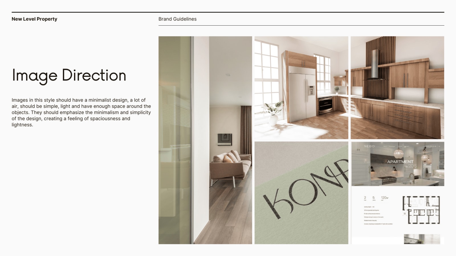
03 · Image direction. Minimalist frames with air around objects — spaciousness as a brand behavior, not a photo filter.
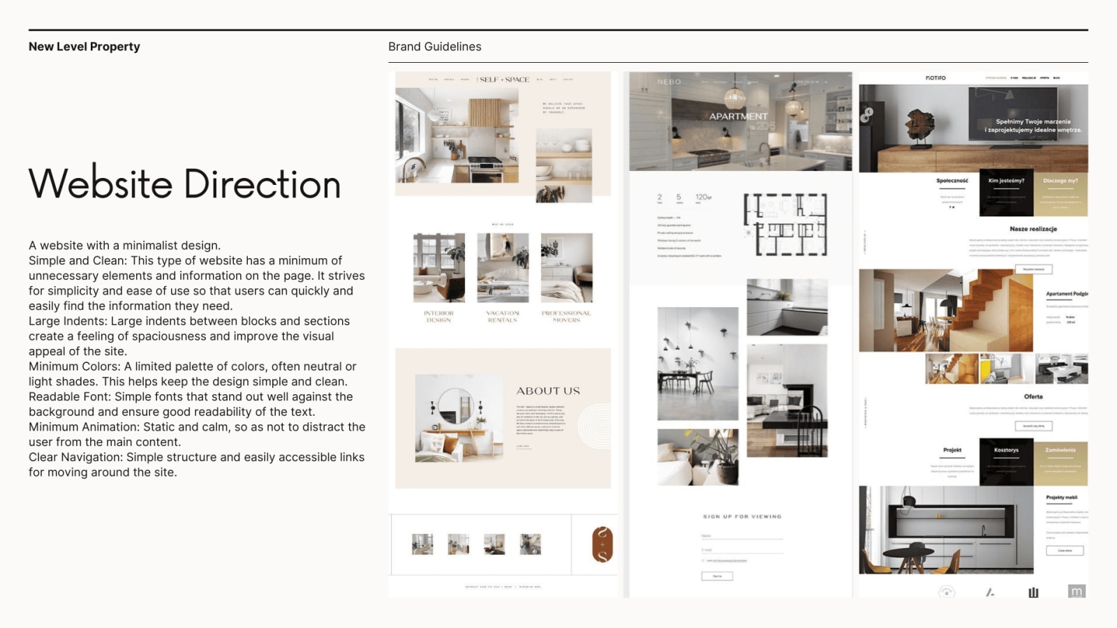
04 · Website direction. Large indents, minimum colors, readable type, calm motion — the guideline written for whoever builds next.
Why this spread matters: the deliverable was a decision system — keywords → palette (olive · coffee · beige · gray) → image rules → web rules — delivered as two complete guideline concepts, so the client chose a positioning, not a favorite picture.
Presentation Design — Concept Labs™
Not slides — presentation architecture: a narrative sequence a prospect can retell after one read.
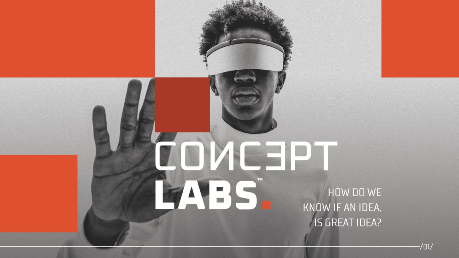
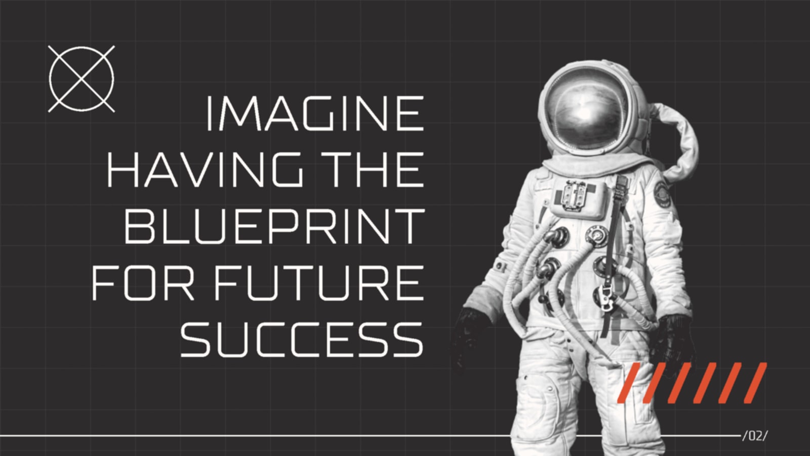
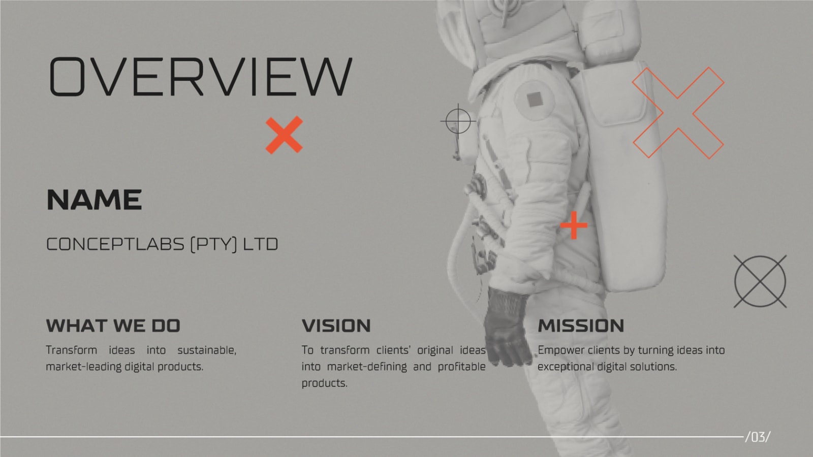
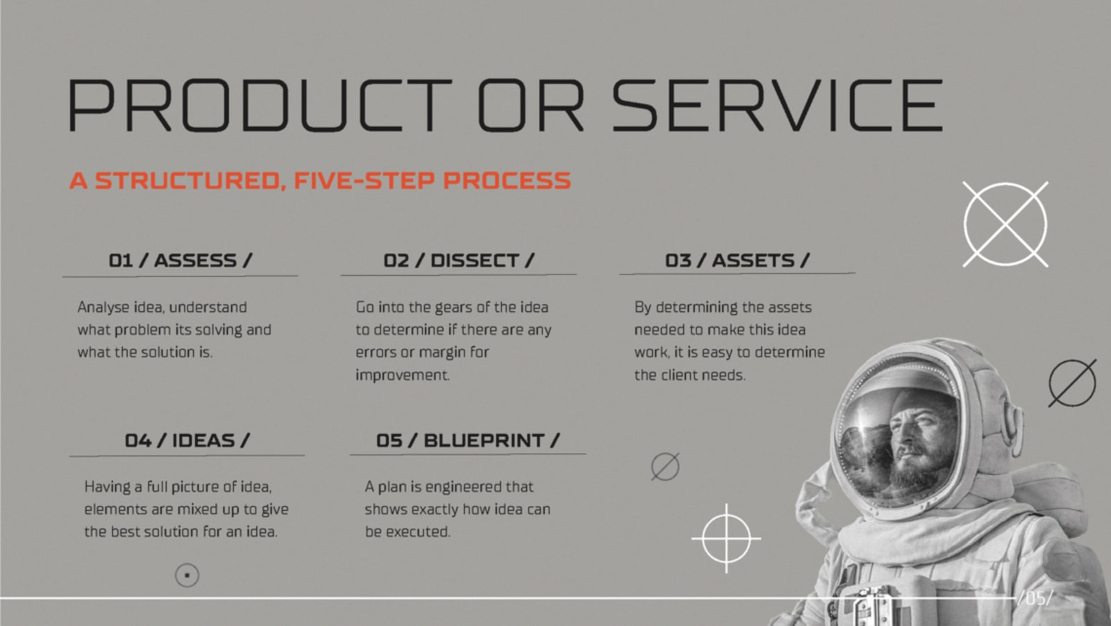
The architecture: question → promise → who we are → method. Reversed-letter wordmark, industrial grid, one signal color — and a five-step framework (Assess → Dissect → Assets → Ideas → Blueprint) positioned as the product itself.
Marketing + Motion
Campaign systems, not exports: range, format discipline, and the testing logic behind every wall.
Campaign Wall






Reading the wall: six verticals, one production discipline — every tile is a hypothesis about a hook, built to be tested. Full system in the Ruby Labs transformation.
Creative Testing



V1 → V2 → V3: baseline, raised stakes, recomposition — losers get autopsies, winners get variation families. The testing logic is the deliverable.
Social Systems
Consistency you can see: one grid, one light, one crop logic — a template a team can run without a designer.
Nine frames, one system. Hospitality account, rebuilt from a scattered feed into a repeatable visual template: consistent lighting mood, one color logic, disciplined crops, and a content hierarchy the client's team applies weekly.
Audience → messaging → templates → consistency → brand perception. The same system logic was applied across hospitality, beauty, and education accounts; before/after documentation available on request.


Web Products
Shipped builds beyond the flagships — design intent defended all the way to production.
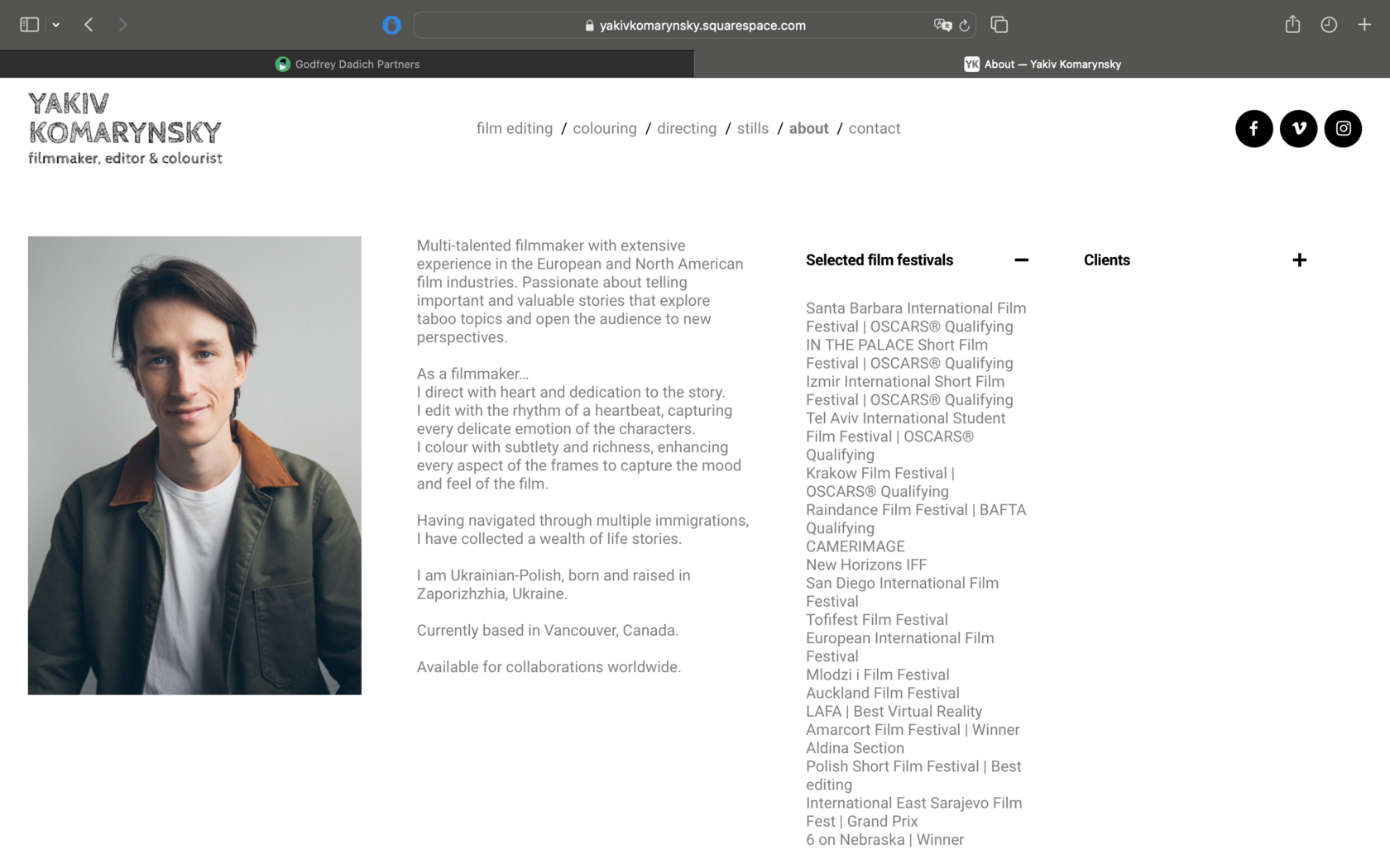
Yakiv Komarynsky. Client-provided design implemented faithfully on Squarespace — custom code where platform limits threatened intent.
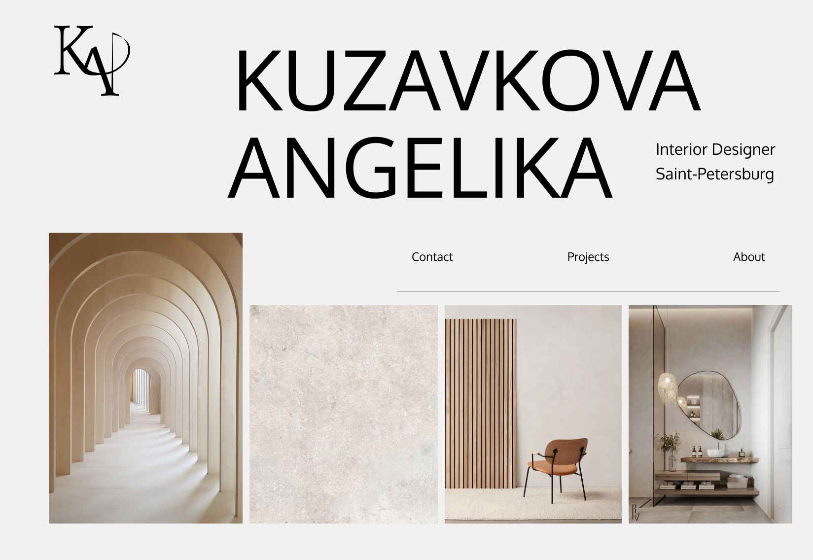
Kuzavkova Interior. Texture-driven site + four logo concepts, handed over with an admin panel — zero designer dependency.
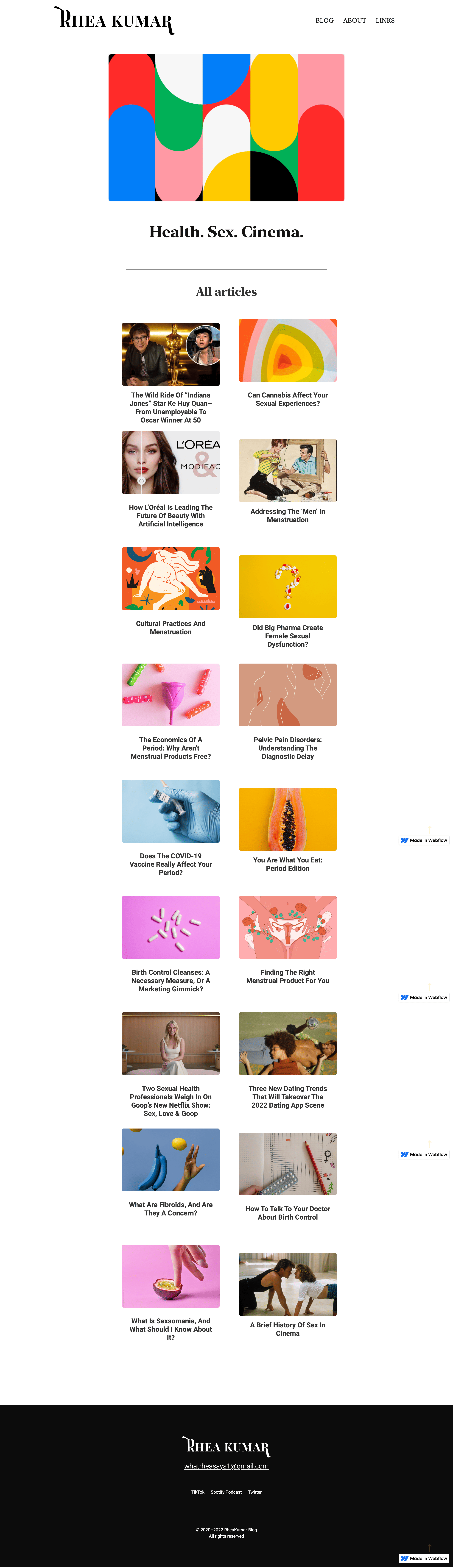
What Rhea Says. 1970s palette and newspaper type matched to a published writer's voice — logo included.